
Friday 27 January 2017
Friday 25 March 2016
planning and evaluating a utc photo-shoot (test shoot)
I'm going to take some photos from my final shooting in UTC
on Friday 4th at school time. For my theme I wanted to take pictures of around
Sheffield of places that have been damaged for example broken down buildings
that have graffiti all over them and rivers with junk thrown in them to show a
side of Sheffield no one really talks about. At the shoot in UTC I could take
some shoots of people and then merge both pictures together on Photoshop to
maybe show what they're thinking or I could take pictures of the room to show
the 'expectations' and then fade it in with a picture from Sheffield to show
the 'reality'. If this doesn't work then I would use it to practise for my
shooting. This idea fits the brief because it shows the true identity of
Sheffield and of what people are actually like. For the shoot I would need a
camera, SD card and maybe a tripod. I'm going to set my camera on the largest aperture
f/4 or f/5.6. and a shutter spend of at
least a 1/125sec to avoid any blurring and camera movement and to get a sharp
photo with a flash to get in all the details. I will take the pictures in jpeg
in single shooting. There won’t be much risk as I'm taking it indoors but there
will be a lot of people so the equipment could get lost or dropped and to avoid
that I will make sure everything is in a safe place and out of any danger. If I
can’t take pictures of someone that I will just take pictures of the room and
do the second idea. To protect the final photos I will store them in two places
for example a SD card and on own cloud. If this doesn't work I will use this
time to explore aperture, shutter speed and lighting so I would have more
control of the camera and that will allow me to get the best pictures in my
final shooting.
recce sheet


Saturday 12 March 2016
LO5: Evaluation
The brief asked me to take a series of images that explore
and show the identity of Sheffield, and with that I have chosen to take
pictures of stuff around Sheffield that are overlooked but represent Sheffield
a lot using colour. I think my theme successfully fit the brief because not
only does it show the small things that represent Sheffield it also shows the
beauty in them and that gives Sheffield a positive connotation. I tried to take
the pictures in a point of view angle to make the audience feel like they are
being toured around the unseen part of Sheffield as they move on to the next
image.
I have studied
different photographers, their genres and the techniques that they us to create
their photos. The photographer I have studied the most that I used for my final
shoot was William Eggleston because the photos he takes aren’t like any other
photos photographers take which court my attention really quick. He defiantly
inspired me to take more photos in his style and has helped me improve on my
photography.
The improvements I would have used more techniques to give
them a professional look and just went out there and take as many photos as I
possibly can of things I like the look of that fit the brief more, maybe have a
theme of photos.
Green screen or Chroma key photography is a process that
allows you to replace a solid coloured background with a background of your
choice. This technique is really helpful because it allows the producers to
create outside the box, let their imagination run wide and produce hundreds of
different style of photography or film.
Text and image is when you add text to your image.
Scaling provides a way to alter the image size without
removing any of the source image. You have the ability to zoom out/in, rotate,
change the width/height and mirror the image.

Cropping is when you remove the unnecessary content in an
image to make what’s left seem bigger in the same frame size, I did this to
some of my images for example:
(I cropped the left and right side slightly)


Layers are images or effects overlaid on top of one another.
The layers can earthier hold part or a whole image. By combining layers you are
able to create exacting adjustments to the images, combine multiple images, or
create new images. I used a Photoshop to create a layered image for my final
photographs.


Wednesday 9 March 2016
LO5: Bibliography
http://duncanphilpott.com/
http://www.egglestontrust.com/
http://www.martinparr.com/
http://improvephotography.com/1305/101-portrait-photography-tips-to-improve-your-photography/
http://www.boredpanda.com/top-10-photographers-for-travel-portraits/
http://digital-photography-school.com/10-tips-for-improving-your-wildlife-photography/
http://www.techradar.com/how-to/photography-video-capture/cameras/night-photography-tips-9-essential-steps-for-beginners-1320947
https://www.smashingmagazine.com/2008/11/60-beautiful-examples-of-night-photography/
http://www.thephotoargus.com/35-superb-examples-of-still-life-photography/
http://www.techradar.com/how-to/photography-video-capture/cameras/21-street-photography-tips-from-the-professionals-1321017
http://uk.complex.com/style/2012/06/the-50-greatest-street-photographers-right-now/
Monday 7 March 2016
LO5: Methods of desplaying my photographs

Gallery setting
I imagine my photography being displayed on different sized canvas that fit the image scale, to prevent any stretching that will ruins the image. The canvas also presents the images in a big scale to allow the audience see all the small detail. This method of display would cost around £90/£100.


video
Friday 4 March 2016
LO5: Descriptions for my photographs

Cow, April 10th 2016, in the afternoon
I took this photograph at Sheffield’s Cow clothing shop at
West Street. In my intentions in
this photograph was to try and represent beauty through second hand clothes. To do this I took this photo of very
eye-catching beautiful clothes hung up on red clothes rail. The bright red is very
effective, it’s a perfect combination with all the different patterns in the
clothes. It helps them stand out and would draw the audience into the image. Sheffield is full with thrift stores with
unique clothes that, they represent Sheffield. Many of the clothes are seen as second
hand or not interesting/new and not a lot of people see the beauty in them so I
wanted to show that in my photography. I took both photographs in a view point angle,
and a slight downwards tilt in the first photo because I want the audience to feel
like they are actually there. When I took
the image I made sure to have the picture in focus and as sharp as possible to
make it look realistic, I did this by having a fast shutter speed, deep depth
of field and having natural lighting. To edit the image and give it that
more retro thrift store feel I added a filter on Photoshop and adjusted the
contrast and brightness to just get it right. My inspiration for this image
came from William Eggleston bright 70s/80s themed photography.
William Eggleston's photograph I was inspired by.

-------------------------------------------------------------------------

Vulgar Simpson, April 10th 2016, in the afternoon
Whilst I was walking around shopping I noticed these little Simpsons
dolls at a thrift store called Vulgar in the City Centre. That street was full
of different designed shops to fit their aesthetic from all black to all bright
yellow with flowers dangling down from the windows. His one looked like a multi-coloured
candy cane, it was very edgy which lead me to look inside. I wanted to represent
the small decoration that represents the shop, like my theme. If I did see
these I probably would have walked away without knowing, it shows that the little
things could be the most important things and the things (the dolls) that
represent the whole thing (the shop). I took both images from a point of view
angle to give hat almost realistic feel, make you feel like you’re there. I made
sure I was taking the photos in a fast shutter speed, deep depth of field and natural
lighting to give it that effect. When I was editing it I tried to make it look
low quality to represent the thrift/second hand side of it and also that it is
the most simple thing but has a lot of beauty in it by adding a retro filter using
Photoshop. My inspiration for this image again came from William Eggleston image
threw a window.

-------------------------------------------------------------------------


-------------------------------------------------------------------------
Bright, April 10th 2016, in the afternoon
 Thoughts, April 10th 2016, in the afternoon
-------------------------------------------------------------------------
 Colour, April 10th 2016, in the afternoon


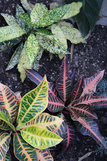
Nature , April 10th 2016, in the afternoon
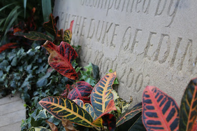
I took this photo at the Winter Garden, with over 2,500
plants from around the world in a massive dome I was sure to take a couple of
photographs there, Sheffield is the greenest city after all so what else
represents it then trees…and flowers. But not a lot of people see these as very
interesting things since there’s so many of them everywhere. I’ve tried to some
into one particular plant to show the beauty of it and show that if people took
the time to look at stuff that they will see so many unique things. The colour
of both plants is complementary colours which makes it a little more dramatic but
still look calming and nice to look at. I took the first picture in a high angle
to catch that shape and colour in the plants and the second image from an angle
to show the line of plants against the rock. Having a fast shutter speed, deep
depth of field and natural lighting made the photo appear sharper and in high
definition. And again I added a filter on Photoshop to make it look retro.
-------------------------------------------------------------------------

Alice takes a trip, April 10th 2016, in the afternoon
I took this shot using a DSLR high quality camera at a
clothing store called Freshmans in Sheffield. I didn’t really have any
intentions when I was taking this photo, I just wanted to show how nicely
thought out and designed it is compared to any other main stream shops. The clothes
where very dark and the wall was pink so I decided to add a pink filter which
gave that pink tone in the clothes and made the picture look very 80s vintage
which is the style of the shop. I think it made it look more interesting than
just a picture of clothes hanging on rails. The photographic technique that I
have used here is composition. I tried to arrange the rails and clothes so that
you could see the clothes hung up on top and the writing and also the bottom
end of the clothes on rails. When I was taking this photo I tried to get it in a straight angle again the eye point of view to make the audiences feel like they are there.
-------------------------------------------------------------------------
The little dancers, April 10th 2016, in the afternoon
I took this picture at Westhill Lane (Devonshire Quarter) of
a friend standing next to some graffiti called The Little Dancers using a DSLR
high quality camera. My intention was to combine reality and art. Like in 'Colour' I used inspiration from Andy Warhol collage of Marilyn Monroe using pop art by
photoshopping the jacket in different complementary colours to make it look
like it all goes together but catch the audience’s eyes. The compositions I was
going for when taking this photo is that the model wasn’t covering the whole
graffiti but looked like she was someone walking past not paying any attention to
the beauty and meaning of it which represents what most people do, I didn’t want
to have a center of interest because I wanted the audience to pick weather they
are more drawn into the bright jacket on the person to the art behind the model.
I took this photo in a fast shutter speed to get a still image and a deep depth
of field to get a clear and high quality image. I thing that it does fit the
brief because it shows both the popular identity of Sheffield and the unpopular
identity of Sheffield.

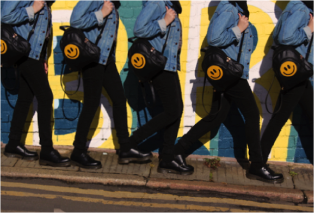
Bright, April 10th 2016, in the afternoon
I took continuous shots using a DSLR high quality camera at Backfields
(Heart of the City) of a friend walk past a wall of graffiti saying ‘stay bright’.
I took this photo in a fast shutter speed to get a still image and a deep depth
of field to get a clear and high quality image. The composition was to have the
model carry a bag with a smiley fast with the same colour and meaning as the
graffiti and her walking past it without realising that, representing what most
people would do, overlook things with positive meaning. It shows the brighter
and happier side of Sheffield by art in fashion and graffiti so I think it fits
the brief perfectly.
------------------------------------------------------------------------- Thoughts, April 10th 2016, in the afternoon
 -------------------------------------------------------------------------
 Colour, April 10th 2016, in the afternoon
I used the same photo that I used in “Thoughts” and a medium
shot of a friend next to a painting on a shop shutter, I took it with a fast
shutter speed and a deep depth of field to get a still and high quality image. I
put them together than added a filer to each one used complementary colour. I
got inspiration from Andy Warhol collage of Marilyn Monroe using pop art. His work
was very eye catching and dramatic but very simple as well and I wanted to do
that with my photography representing Sheffield in colour.
-------------------------------------------------------------------------

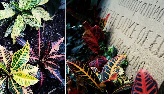
Vintage doll, April 10th 2016, in the afternoon
I took this shot using a DSLR high quality camera at a
clothing store called Sydandmallory in Sheffield. The store was full of
decoration but what court my eye was the weird looking wall with flowers in
every corner and a unique combination of shoes hanging down to suit bags with rope
in them and vintage mirrors. My intention was to show the beauty in over looked
things that represent Sheffield using colour so what I did was add a filter to
finish that 80s look then edit half the picture in black and white to show how
powerful colour is. It also could show that one half is how people would see
overlooked things (dull/old) vs how they actually are, full of colour and
beauty. I took the picture horizontally to get in all the objects and used composition,
all the objects won’t really be seen together or places in that order so that
makes the photo seem more dramatic and eye-catching. I took this shot with a
fast shutter speed and a deep depth of field to get a still and high quality
image.
Wednesday 2 March 2016
LO4: Edits
Before

After
Before

After


To make this image I first opened it up on Photoshop then edited the brightness to -19 and the contrast to 39. I then played around with the curves and the levels until I got the image like I wanted it. Then I added the second image and moved it around to where I wanted and on top I added a colour lookup, 3DLUT file to filmstock_503dl to get the vintage filer effect. And finally I used the shape tool to add a white line between the two images to separate them apart and finish the image.
To make this image I basically repeated the same steps for edit one and two but changed the brightness and contrast to fit the picture


To make this image I basically repeated the same steps for edit one and two but changed the brightness and contrast to fit the picture
Before

After

I tooK this photograph at a thrift shop called 'cow' in Sheffield. In Photoshop I changed the brightness to -9 and the contrast to 39 then I added colour lookup - abstract - cobalt - carmine to get the pink overlay.


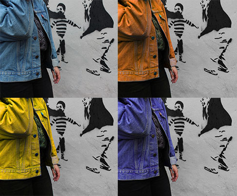
For this image I asked a friend to stand in front of a black
and white graffiti then I took the picture with my canon DSLR. On Photoshop I
edited the hue and saturation four times with different complementary colours.
I tried to combine the modern and old (fashion and graffiti) identity of
Sheffield together using colour.


I took continues shots of a friend walking past some
graffiti, I then opened the last shot on Photoshop and overplayed it with the
second shot, I used the easer tool to remove the background from each picture
to create the end result. I adjusted the brightness and exposure to because
there was too much light in the images. The aim of this shoot was to represent
fashion and graffiti to identify Sheffield, the graffiti said "be
bright" so I chose a smiley face bag in the same colour so match with the
graffiti. I wanted to show that graffiti has more meaning then just art and
words, it can be inspiring. this editing shows movement ( the person walking)
to show that where ever you go in Sheffield there will always be some sort of
inspiration or something that will cheer you up.
Before After
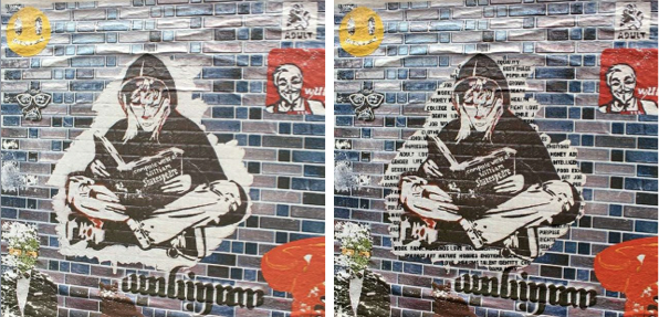
I took this close up of a sticker next to some graffiti, I decided use Photoshop to add words of things that identify people such "emotions" and "talent" in the white area around him.
Before
Before

After
I added a black and white filter than moved properties around to get the right tone. I then used the quick select tool to select around one half of the photo and removed the black and white using the eraser. And that is how I made this edit.

Before


After


I put both pictures next to each other than added a colour lookup, 3DLUT file - TensionGreen.3DL, Soft_Warming.look, EdgyAmber.3DL and HorrorBlue.3DL. The colours I chose are complementary colours which makes it look more eye-catching and interesting.


Subscribe to:
Posts (Atom)